& More
Exploring what underpins our material world
Directed by Tsz-wing Ho
Join us as we venture into the monochromatic marvel of Tsz-wing Ho's 2D digital animation, & More - a visual journey that transcends the traditional confines of a museum. Through a flow of abstract animated geometric shapes, we are drawn into the architectural tapestry of Hong Kong's iconic M+ museum, unravelling its essence layer by layer. More than just a film, this captivating exploration deconstructs the very notion of a museum, reimagining it as an object itself.
& MORE delves into the architecture of the M+ museum, challenging the conventional view of a museum as an object itself. Can you elaborate on your creative approach to transforming architectural elements into a visual narrative?
& MORE is a 2D digital animation completed for my group assignment during college study. We chose the M+ museum building as the theme of our animation as it is the largest museum of modern and contemporary visual culture in Hong Kong which is also the new landmark in the West Kowloon Cultural District.
When we were creating the film, the M+ museum building was closed because of the outbreak of COVID-19. Therefore, we were unable to visit the interior design of the museum. Instead, we collected information on the Internet for the characteristics of interior design inside the museum. We also conducted the site visit and took photo records of external architectural elements of the museum building, for example, the bamboo-like tiled facade and the concrete materials.
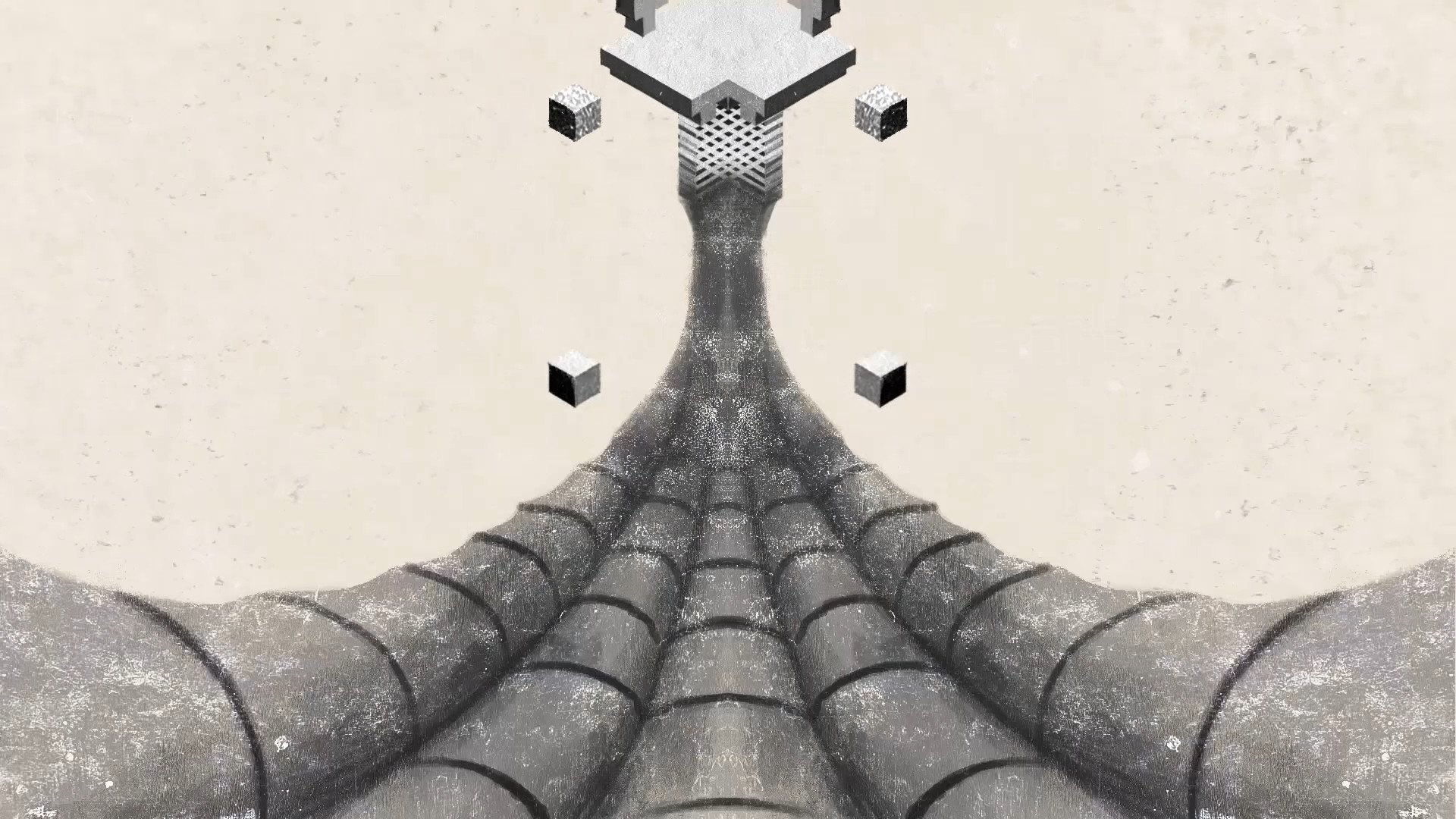
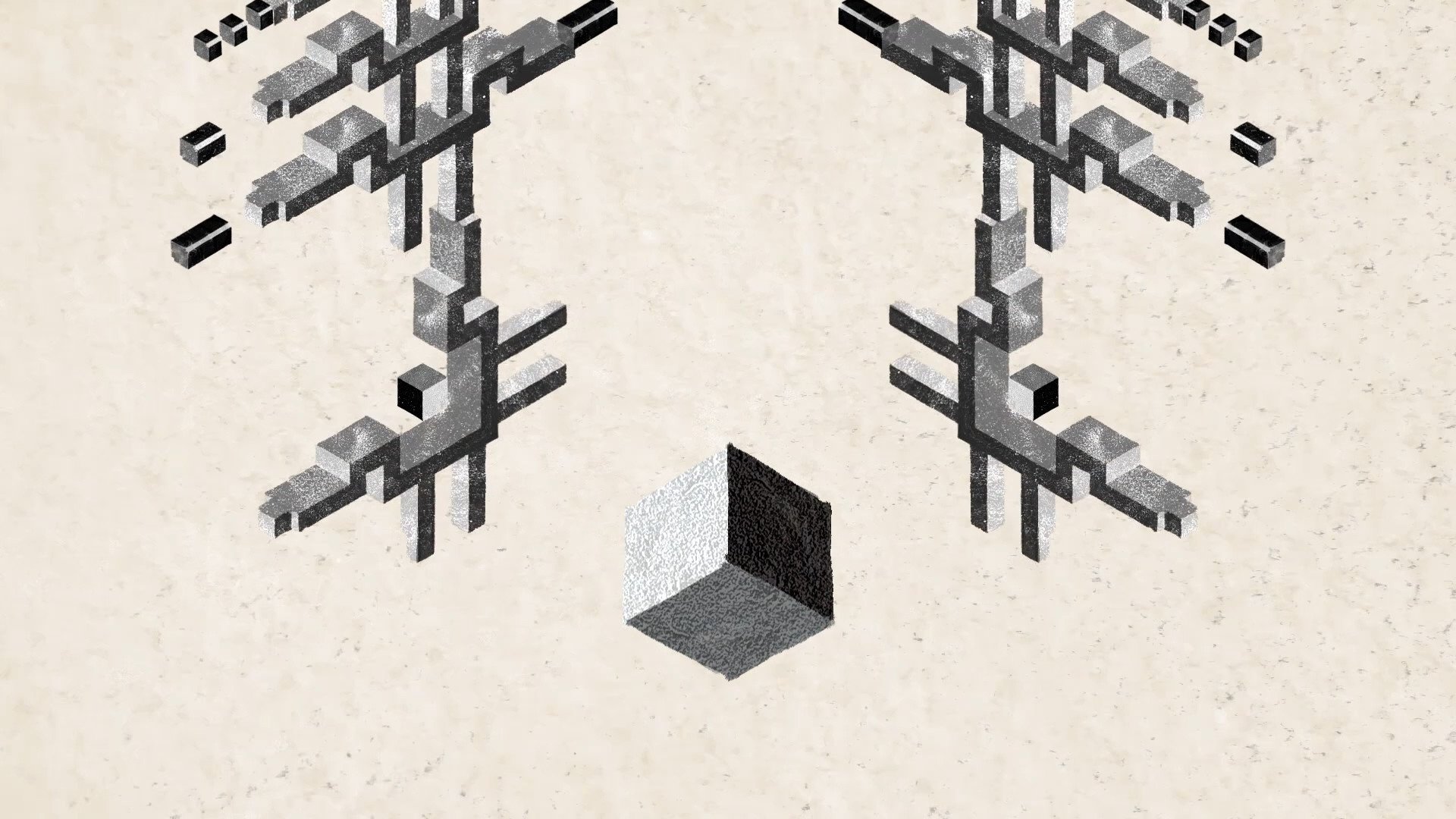
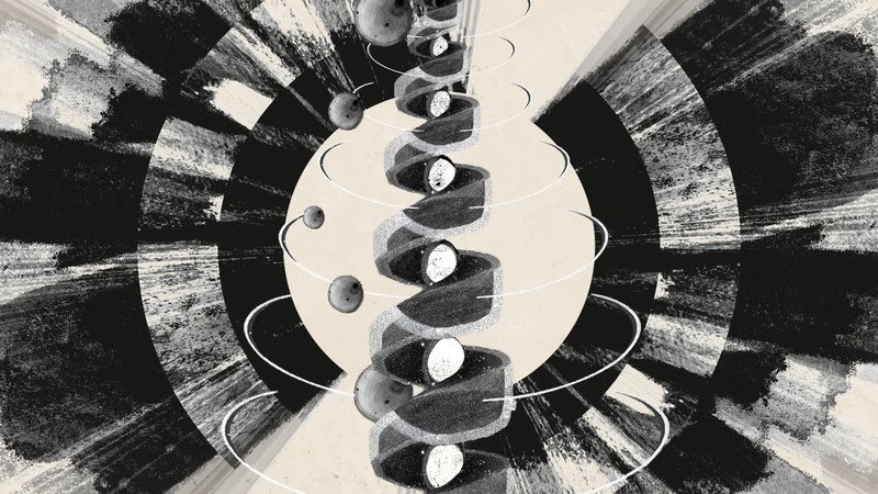
We finally chose the most outstanding three characteristic aspects of the M+ architectural design which are the shape of the M+ building, the bamboo tiled facade and the spiral staircase. The features of M+ building are simplified and transformed into geometric shapes such as cylinders, cuboids and spheres making those objects animated conveniently and effectively. After several experiments, we combined those elements to construct a visual narrative that continues to develop downward. Also, the animation is made in monochrome which is the main color tone we found in the M+ museum.
The concept of exploring what underpins our material world through the M+ museum is fascinating. What inspired you to choose this subject matter, and how did you navigate the balance between abstraction and conveying a meaningful narrative in your animation?
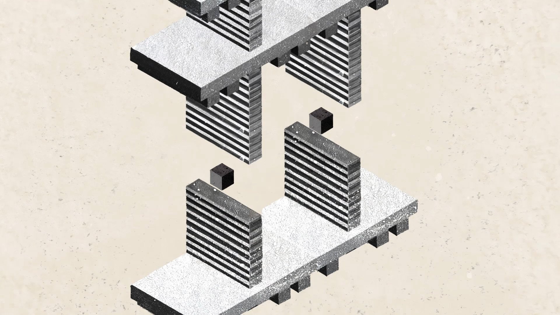
While we were drawing and animating the shape of the M+ building, we figured out this theme. The film aims to challenge the fundamental definition of a museum. We perceive a museum as more than just a museum, we look at it as an object itself. So we consider the relationship between objects and their nature in our material world. Everything begins with simple elements. For example, the M+ building is formed by cuboids at the beginning of our film.
Audiences interpret animation subjectively. Some people think that there are geometric elements that flow across the screen with no meaning. Some people may understand the artist’s intention in the movie. The meaning of the abstract animation can be defined by the audience themselves. That is the interesting thing about making abstract animation. Therefore, I think it is difficult to convey a meaningful story in abstract animation. I still exploring the way to balance them.
Your animation work has garnered recognition, including the Best Abstract Animation Award at the London International Animation Festival. Could you share some insights into the animation techniques employed in & MORE?
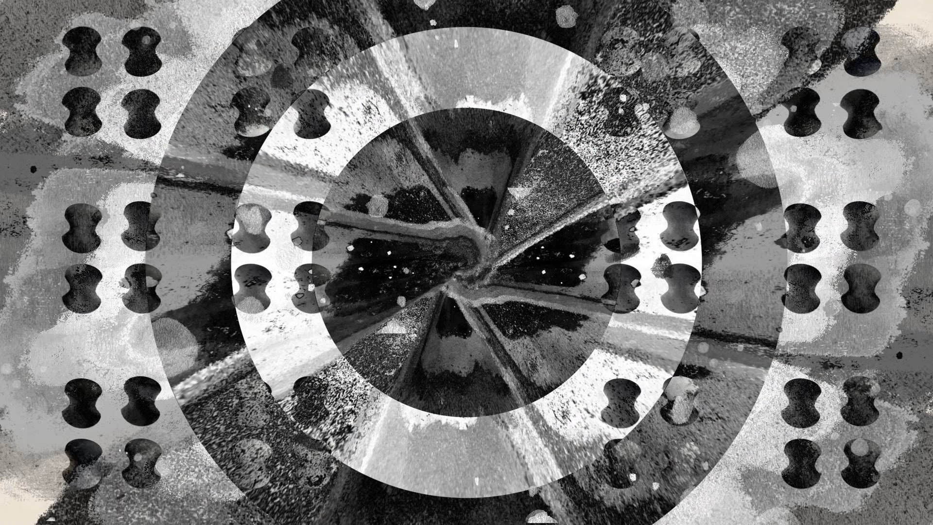
The project is completed in Photoshop, Procreate and After Effects. We drew objects in Procreate and Photoshop. Then, we applied the concrete texture that we took photos of the stairs and walls in the M+ museum on the drawn elements. Inserting those elements in After Effects for editing to synchronize with sound and finalizing the work.
“The film aims to challenge the fundamental definition of a museum. We perceive a museum as more than just a museum, we look at it as an object itself.”
The M+ museum serves as a central theme in your film. How did the architecture and design of the museum influence your creative decisions, and were there specific elements of the building that you found particularly inspiring or challenging to animate?
I would say that the M+ building has a distinctive architectural design. We were captivated by the bamboo-tiled facade, the spiral staircase in its interior and the shape of the M+ museum. The shape of the M+ museum inspires us to start with a cuboid and continue to develop complex structures of a building like playing with Lego.
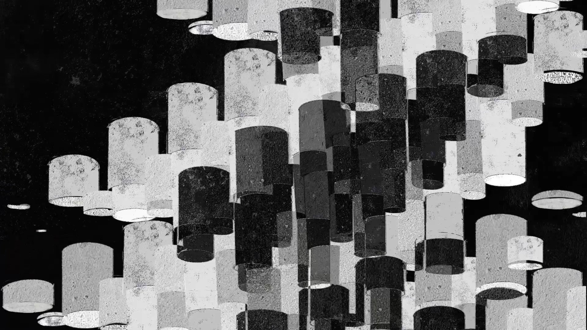
The idea of balls rolling down from the staircase in the animation is inspired by the spiral design of the staircase. Then, the bamboo-tiled facade is difficult to animate because of the complex features of the real-tiled facade. So we decided to simplify the design of the bamboo-tiled facade and replaced it with cylinders. The cylinders are arranged in a line to look like an exterior wall of the M+ museum
Having explored abstract art and animation in various projects, are there specific themes or techniques you are eager to explore in your future works?
I have used human hands as the subject of my animation before which is called Hand. I would like to continue exploring the body part in my future works. I think it would be fun to animate our body parts. I love making ordinary or daily things into something unexpected or weird. Providing a different perspective to see our body and our life. Maybe combining different techniques like photographic stop-motion or collage with drawing in my future animation.
Director: Tsz-wing HO
Animation: Tsz-wing HO
Animation: Tsz-wai PUN
Editor: Tsz-wing HO
Sound: Long-man LUK
Advisor: Max Hattler

